A way to evaluate potential profit on an investment by making a projection of growth over several years. For example, if a company makes a 7% profit increase in the prior quarter, an accountant could project 7% profit increase for the next quarter.
Put trusted Stock Trader’s Almanac strategies to work for your portfolio with Almanac Investor — a digital subscription designed to help active investors implement cyclical, seasonal, and historical market insights with online tools, calculators, alerts and weekly eNewsletter that call out opportunities as they happen. Learn More!
In-depth, monthly email newsletter packed with recommendations, analysis, detailed charts and more.
Investor Alerts View Sample
Weekly emails noting market sentiment, buy recommendations, key triggers to watch, and strategy updates.
Online Research Tools View Sample
Over 15 calculators and tools including Moving Average Convergence/Divergence indicator (MACD), Volatility and Free Lunch.
FREE copy of the Stock
Trader’s Almanac desk
edition Full Details.
A time-tested guide to stock trading market cycles. Published every year since 1968, the Stock Trader’s Almanac is a practical investment tool with a wealth of information organized in calendar format. Everyone from well-known money managers to savvy traders and investors relies upon this annual resource for its in-depth analyses and insights. The Stock Trader’s Almanac 2013 contains essential historical price information on the stock market, provides monthly and daily reminders, and highlights seasonal trading opportunities and dangers. Learn More!
The Stock Trader’s Almanac 2013 is packed with timely insights and targeted analysis to help you navigate turbulent markets and beat the odds in the year ahead. This trusted guide combines over a century’s worth of data, statistics, and trends along with vital analysis you won’t get anywhere else. Learn More!
Alerts you to little-known market patterns and tendencies to help forecast market trends with accuracy and confidence
An indispensable annual resource, trusted for over 40 years by traders and investors
The data in the Almanac is some of the best in the business
For its wealth of information and the authority of its sources, the Stock Trader’s Almanac stands alone as the guide to intelligent investing.
An indispensable resource for today’s active commodity, currency, futures, and ETF trader. In the 2013 Edition of the Commodity Trader’s Almanac, Jeffrey Hirsch has once again put together an essential tool for both professional traders and those who are just getting started and need to understand the complex and exciting world of alternatives. Created in a similar fashion to the Stock Trader’s Almanac—trusted for over 40 years—the Commodity Trader’s Almanac is a comprehensive guide featuring monthly strategies, patterns, trends, and trading techniques geared towards the major commodities and currencies, as well as ETFs, futures, and options. Learn More!
It also contains in-depth insights on various topics of interest to the active trader and investing public; as well as market highlights that cover key supply, demand, and seasonal tendencies on markets including crude oil, ethanol, and precious metals; critical agricultural products such as corn, wheat, and cattle; and foreign currencies like the British pound and the Euro. The Commodity Trader’s Almanac also describes how investors can utilize futures, options, and ETFs in their endeavors. Learn More!
Helps you understand how commodity pricing works and offers great insight into investing in them
Alerts you to little-known market patterns and tendencies to help forecast commodity market trends with accuracy and confidence
Contains expanded coverage on timing tools with tips on utilizing candlesticks and pivot points to better time seasonal trades, and more
Includes business cycle analysis and trading tips for the current climate
Intended for active traders and investors interested in making the most out of today’s commodity, ETF, futures, options, and currencies markets, this guide will make you a better trade in the search for greater profits. Learn More!
A series of technical indicators used by traders to predict the direction of the major financial indexes. Most market indicators are created by analyzing the number of companies that have reached new highs relative to the number that created new lows, also known as market breadth. By weighing those indicators showing Bullish signs against those showing Bearish signs, you are able to weigh your risk in the current market.
2) DOW Relative Strength Index RSI: A technical momentum indicator that compares the magnitude of recent gains to recent losses in an attempt to determine overbought and oversold conditions of an asset. When RSI is above 50, it is considered a positive indicator for market direction. It is calculated using the following formula:
RSI = 100 – 100/(1 + RS*)
*Where RS = Average of x days’ up closes / Average of x days’ down closes.
3) NYSE MACD: A trend-following momentum indicator that shows the relationship between two moving averages of prices. The MACD is calculated by subtracting the 26-day exponential moving average (EMA) from the 12-day EMA. A nine-day EMA of the MACD, called the “signal line”, is then plotted on top of the MACD, functioning as a trigger for buy and sell signals. The black line above red is a positive indicator.
4) NYSE Fast Stochastic: The stochastic momentum oscillator is used to compare where a security’s price closed relative to its price range over a given period of time.
5) NYSE McClellan Oscillator: The McClellan Oscillator offers many types of structures for interpretation, but there are two main ones. First, when the Oscillator is positive, it generally portrays money coming into the market; conversely, when it is negative, it reflects money leaving the market. Second, when the Oscillator reaches extreme readings, it can reflect an overbought or oversold condition.
6) Advance/Decline Line: Every day that stocks are traded, financial publications list the number of stocks that closed higher (advances) and that closed lower (declines). The difference between these numbers is called the daily breadth. The running cumulative total (starting at 0) of daily breadth is known as the Daily Advance-Decline Line. It is important because it shows great correlation to the movements of the stock market, and because it gives us another way to quantify the movements of the market other than looking at the price levels of indices.
A national government that owes money to international financial institutions such as the World Bank, foreign governments, or to foreign lenders. A debtor nation will have a negative balance of trade because the amount of money coming into the country from outside sources is greater than the amount of exports and money that the country sends out.
Indicators related to specific times of the year that try to predict year end stock market results. For example, the First Five Days of January Indicator has an 85% success ratio for years where the first five trading days have positive results. Generally the seasonal indicators are centered around shopping seasons. Mainly Christmas. The amount of spending in these months are usually a strong indicator for how the economy is doing.
More details on seasonal indicators
: It can also be a good idea to look at lows in typical spending. This is usually times like September and January (usually after highs). One key month to look at is in august for back to school spending. It can be argued that this spending is even more important than Christmas spending as it is usually considered to be more important items.
January has been found to have two 85% reliable early warning systems for predicting the year’s market results. The first uses the S&Ps results from January’s first five days and the second uses the S&Ps results from the entire month. With an 85% success record, this seasonal indicator must be taken seriously!
First Five Days
When we look at the last 40 times that the S&P posted gains in the first 5 days of January, the market as a whole posted gains for the year 34 times or 85% of the time. On average, these years generated S&P gains of 14%. We have to look back to 2002 for the last time this indicator gave faulty results. That year the first five days produced 1.1% gains and the market fell 23.4% for the year.
When we look at the 23 years that the S&P fell during the first five trading days of the year, the market finished the year in negative territory less than half of the time.
This year, this indicator seems to be sending the signal for strong gains as the the Standard & Poor’s 500-stock index first five trading days of 2013 produced 2.2% gains. That bodes well for investors. If we see historic average results in 2013, we can expect the DOW to end the year at 14,939 and the S&P 500 to exceed 1,655.
The January Barometer
So, is the quick start in 2013 a sign of more gains to come? According to the Stock Trader’s Almanac’s “January Barometer”, as January goes, so goes the market. Since the 1950s, this indicator has found a 90% correlation between the stock market rising in the first month of the year to the market finishing the year with solid gains.
The January Barometer has been wrong only seven times since 1950. The last time January was wrong was in 2001, when a 3.5% gain in the year’s first month ended up in a 13% market slump by the end of the year.
The stock market ended January 2013 with the Dow Jones Industrial Average up nearly 6%, the best month since October 2011. Therefore the January Barometer supports the First Five day indicator predicting a strong year for the market.
Summary
The theory supporting the early-year gains indicators is that investors typically enter each year with fresh optimism. With a positive outlook, they will pour fresh cash into the market. We would also expect that investors aware of the positive January indicators will be more likely to make larger investments.
Side Note
When the Santa Clause index, the First Five Days index and the January Barometer all report positive gains, it is even a better sign for the year. Unfortunately, the Santa Clause Indicator did not support the two January indicators.
A technical analysis indicator that compares advancing and declining stock issues and trading volume as an indicator of overall market sentiment. The Arms Index, or TRIN (Traders Index), is used as a predictor of future price movements in the market primarily on an intraday basis.
The Absolute Breadth Index (ABI) is a market indicator used to determine volatility levels in the market without factoring in price direction. It is calculated by taking the absolute value of the difference between the number of advancing issues and the number of declining issues. Typically, large numbers suggest volatility is increasing, which is likely to cause significant changes in stock prices in the coming weeks.
Details on Absolute Breadth Index
: It highly related to the advanced decline line. The calculation of the ABI uses the number of Advancing and Declining issues and compares that to the previous one. The calculation is quite complex but luckily there are multiple charting softwares and ways to get this information. The easiest of which is most technical chart softwares have this built in so the calculation is not necessary.
A technical analysis tool that represents the total difference between the number of advancing and declining security prices. This index is considered one of the best indicators of market movements as a whole. Stock indexes such as the Dow Jones Industrial Average only tell us the strength of 30 stocks, whereas the advance/decline index can provide much more insight into the movements of the market.
In general, rising values of the advance/decline can be used to confirm the likelihood that an upward trend will continue. If the market is up but there are more declining issues than advancing ones, it’s usually a sign that the market is losing its breadth and may be getting ready to change direction.
Imagine that the advance/decline index on the S&P 500 is currently at 1835. If at the end of the last trading day, 300 stocks were up (advance) and 200 were down (decline), 100 would be added to the advance/decline index value, pushing it to 1935.
By aggregating the value of a related group of stocks or other investment vehicles together and expressing their total values against a base value from a specific date. Market indexes help to represent an entire stock market and thus give investors a way to monitor the market’s changes over time.
Explanation
Index values are used by investors to track changes in the stock market over long periods of time. For example, the widely used S&P 500 Index is computed by combining 500 large-cap U.S. stocks together into one index value. Investors can track changes in the index’s value over time and use it as a benchmark against which to compare their own portfolio returns.
Stock market games are a great way for students and individuals to learn about investing and personal finance. These games simulate real-world trading experiences, allowing participants to make decisions about buying and selling stocks, bonds, and other financial instruments. But how do you win a virtual trading game? The answer lies in understanding the unique characteristics of these games and developing strategies that take advantage of their rules and limitations.
To Win: Be Aggressive
Winning virtual trading games, like HowTheMarketWorks.com, where the stock market game has a short duration and there are no trading criteria (the game does not specify the type of stocks eligible to be traded), requires entirely different tactics than you would use with your own money. They require you to be very aggressive!
To be more aggressive in virtual trading games, you need to be willing to take calculated risks and trade stocks that may not be suitable for your own portfolio. This means having a higher risk tolerance and investing in stocks that may have a higher potential for loss, but also have a higher potential for gain.
For example, a very aggressive investment would have been investing in Tesla (TSLA). Back in 2016 it was trading below 20 dollars per share. At that time, many stock analysts were bearish on the company, they were concerned about how how they would deliver on their ambitious plans for electric vehicle production. However, Tesla’s stock price more than quadrupled over the next 4 years, reaching almost $300 per share in 2020. Imagine if you were holding TSLA in your virtual brokerage account back then?
Another example was the surge in GameStop (GME), when in 2021 retail investors coordinated on a SubReddit one of the biggest short squeezes in the history of stock trading. Anyone who bought shares in GameStop around that time would have benefitted from the rally up to nearly $500, (while in 2024 it’s back down to around $25 per share). In stock market games, being aggressive means being willing to take on more risk in order to potentially achieve higher returns.
To Win: Follow The Market
The most important step is to identify the direction of the financial markets. This step is necessary if you only have one account to trade in the stock market game. If you have two or more, then you can cover your bets by going long in one account and short in the other. But if you only have one account, you must make sure you are on the right side of the stock market.
For a novice trader, the easiest way to determine the market’s direction is to look at one of the market indicators. They are all relatively difficult to understand for a novice but that is ok. You don’t need to understand them to use them. All you need is to find a site that will interpret the market direction. For example, if you look at the S&P 500 Bullish Percent Index chart and look to see if the chart is showing green (bull market).
If the market indicators confuse you, you can look at a chart of a market index. All of the most popular are listed at http://stockcharts.com/. The most popular index is the Dow Jones Industrial Average chart. Look at the direction of the chart (up or down) and determine if you are a bull or a bear. In other words, do you think the market will continue to go up (bear) or will it go down (bear).
Once you decide the direction of the market, you will need to identify which stocks have the most potential to move in that direction the fastest – as you are under time pressure from the stock market game.
Read more about How to Put Together Your Formula so you understand your investing strengths and weaknesses, and what you are willing to risk while virtual trading!
Top Stock Picks To Beat The Market
To get the stock picks that beat the market, subscribe to the best stock picking service.
TO WIN: Use Leveraged ETFs as they Provide Fast Returns
Leveraged ETFs are known as a “cheat” by regular stock game players as these ETFs typically provide far faster returns. ETFs are Exchange Traded Funds that act like Mutual Funds but trade like stocks. Leveraged ETFs use financial derivatives (a sophisticated means of trading) and debt (like bonds) to amplify the returns of a variety of indexes. Once again, it is not important to understand Leveraged ETFs, but they will provide far faster returns than regular stocks, bonds, ETFs or Mutual Funds.
Since you have already chosen your best guess at the direction of the market, choosing a Bull ETF (market going up) or Bear ETF (market going down) will be easy. Leveraged ETFs come in several multiples of an index including 2X and 3X ETFs. A 2X will try to double the return on its specified index and a 3X will try to triple its index. Of course, you will want to use 3X ETFs. The highest rated 3X ETFs are:
3X Bull ETFs
Direxion Financial Bull 3X – Triple-Leveraged ETF (FAS) Direxion Small Cap Bull 3X – Triple-Leveraged ETF (TNA) Direxion Large Cap Bull 3X – Triple-Leveraged ETF (SPXL)
3X Bear ETFs
Direxion Financial Bear 3X – Triple-Leveraged ETF (FAZ) Direxion Small Cap Bear 3X – Triple-Leveraged ETF (TZA) Direxion Large Cap Bear 3X – Triple-Leveraged ETF (SPXS)
Note to Instructors
We highly recommend that you set-up your virtual stock market game so that stocks must have a value over $10 to avoid the problem with Penny Stock trading. Yes, a student can achieve far greater returns in the risky world of day trading penny stocks, but it will teach them little about real world stock market trading.
Conclusion
Virtual trading games are a unique and exciting way to learn about investing and personal finance. By understanding the rules and limitations of these games, you can develop strategies that take advantage of their characteristics and increase your chances of winning. Remember, the key to success in virtual trading games is to be aggressive, follow the market, and buy stocks that provide fast returns. However, it’s important to know that virtual trading is very different from real investing.
Remember this is a virtual stock market game. It’s okay to make mistakes as you practice portfolio management with virtual money and virtual stocks. As you test out different stock ideas, keep in mind your risk tolerance. Based on your past performance, you’ll seen discover how much risk you’re willing to take on. The best way to learn how the market works is to stay informed about the companies or industries you’re investing, in so you’re ready to get started for real life investing.
In real-world investing, it’s essential to be realistic, diversify your portfolio, and have a wealth management mindset. Your goal is to preserve and grow your wealth responsibly so you can reach your financial goals with as little financial stress as possible.
Glossary
Market Indicators: Technical indicators that are used by traders to predict the direction of the major financial indexes. The most known are the Advance/Decline Index, Absolute Breadth Index, Arms Index and McClellan Oscillator.
Leveraged ETFs: An exchange-traded fund (ETF) that utilizes financial products and monies due to enlarge the returns of an underlying index. Leveraged ETFs are accessible for almost all indexes, like the Nasdaq-100 as well as the Dow Jones Industrial Average.
Market Index: By aggregating the value of a related group of stocks or other investment vehicles together and expressing their total values against a base value from a specific date. Market indexes help to represent an entire stock market and thus give investors a way to monitor the market’s changes over time.
Simplest, oldest, and most common form of business ownership in which only one individual acquires all the benefits and risks of running an enterprise. In a sole-proprietorship there is no legal distinction between the assets and liabilities of a business and those of its owner. It is by far the most popular business structure for startups because of its ease of formation, least record keeping, minimal regulatory controls, and avoidance of double taxation.
Candlestick charts are the first known style of chart analysis. As you look at this chart, it is made up of many red and green bars which are called candlesticks. They are called candlesticks as they resemble a candlestick with a wick coming out the top and bottom.
Technical Analysis Class One
The Green candlesticks represent one time period where the stock increased in value. The Red candlesticks represent a time period where the stock decreased in value. The time period that each candle represents can be anything from a minute to an hour, to a day or even a month. If we are building a chart that represents a day, we might specify that each candlestick represents a minute or five minutes. If we were trying to build a chart for a year, we might specify that each candlestick represents a day or a week.
Candles are really easy to understand. We need to start with the open price of a stock, the close price of a stock, the highest price the stock hits during the day and the lowest price the stock hit. All these pieces are illustrated in a candlestick.
Let’s start with a candlestick that represents a stock increasing in price for one time period. The body of these candlesticks are green.
The OPEN PRICE of the stock is the top of the body.
The CLOSING PRICE of the stock is the bottom of the body.
The body of the candlestick is green to represent the stock increasing in price for the day.
The HIGHEST PRICE for the day is the highest point of the upper wick. The upper wick is called the UPPER SHADOW.
The LOWEST PRICE for the day is represented by the lowest point of the lower wick. The lower wick is called the LOWER SHADOW.
This illustration quickly shows the action of the price during the entire day. In another class we will discuss how a single candlestick along with volume will give any investor valuable information about the future direction of the market.
Let’s now look at a candlestick that represents the stock value going down for the day. As you might guess, this candlestick isred to identify the loss.
In the case of a red candle, the OPENING PRICE is seen as the bottom of the candle body.
The CLOSING PRICE is the top of the candle body.
The bottom of the lower wick is the LOWEST PRICE the stock hits during the day.
As you would guess, this lower wick is called the LOWER SHADOW.
The top of the upper wick represents the HIGHEST PRICE the stock reaches and just as with the green candle, the upper wick is called the UPPER SHADOW.
Sometimes you will see green candlesticks represented by hollow and black-filled candlesticks. In these cases the hollow candlesticks represent the price closing higher than the open price. The black-filled candlesticks represent the price decreasing on that day like a red candle.
Chart Analysis Class Two
LONG VERSES SHORT BODIES
The longer the body of a candlestick, the more the pressures for the stock to increase or decrease in price verses the opening price. A short bodied candlestick represents a consolidation of price where buyers and sellers were more in agreement on what the price of the stock should be.
Long hollow or green candlesticks show STRONG BUYING PRESSURE. The longer the body the farther the close was from the open and the more the price increased from the opening price. Often this represents strongbullish pressures but this is also dependent on volume and the pattern that the prior candlesticks have created. If this long green or clear bodied candlestick occurs at the bottom of an extended period of price decline, it might show that the bulls have dug in and set a price that they feel is too low. If they defend this price and continue to buy at this price forcing the stock up in value, it is called a resistance price.
Long black or red candlesticks show STRONG SELLING PRESSURE. If the long bodied candle was red or solid black, it might show panic where those who had held on to the stock admitted that the stock would fall or it might show that an institution was ready to dump a large block of their holdings to take profits.
Long vs Short Shadows
The upper and lower wick or shadows can show very valuable information about a trading session. Upper Shadows represent the day’s high price and the Lower Shadow represents the day’s lowest price. Days with short shadows indicate that most of the trading happened near the open and close prices. Candlesticks with long shadows show that buyers and/or sellers fought losing battles to bring the price higher or lower. When the top shadow is long, it shows that the buyers (also called the bulls) fought to take the price higher and lost as the sellers (or bears) pulled the price down again. The bottom shadow represents the sellers driving the price down and the buyers helping to pull it back up again.
Candlestick Patterns Class Three
Candlesticks have several standard shapes which each have their own meaning to a trader.
Marubosu – Candlesticks with long bodies and very short or no wicks are called Marubosu. This is a candlestick that shows that there was tremendous pressure to buy (green Marubosu) or sell (red Marubosu) for that trading period. The candlestick has far more significance to traders and technical analysts when put into context of a complete chart and volume information. For example, when a red Marubosu occurring at a point of resistance (at a stock price that the stock has previously not been able to break through) would be a strong signal for a reversal. When it occurs near support (a price that the stock has previously not been able to fall below) it is also a bearish signal that the stock will continue in a bearish trend. If combined with a spike in volume, it is an even more compelling sign.
Spinning Tops – Candlesticks with a long upper shadow, long lower shadow and small real body are called spinning tops. One long shadow represents a reversal of sorts; spinning tops represent indecision. The small real body (whether hollow or filled) shows little movement from open to close, and the shadows indicate that both bulls and bears were active during the session. Even though the session opened and closed with little change, prices moved significantly higher and lower in the meantime. Neither buyers nor sellers could gain the upper hand and the result was a standoff. After a long advance or long white candlestick, a spinning top indicates weakness among the bulls and a potential change or interruption in trend. After a long decline or long black candlestick, a spinning top indicates weakness among the bears and a potential change or interruption in trend.
Long Upper or Lower Shadow – Long upper shadows warn that there may not be enough demand at higher prices to continue to propel the stock upward, at least for the short-term. Although the stock or index may have formed a higher high, it has closed well off that high. This is especially evident near an overhead resistance area, and/or when a stock or market is overbought. These tails suggest that bullish traders are taking profits on long positions and bearish traders may be initiating short positions.
Long lower shadows warn that lower prices are being rejected. Even though the stock or index may have formed a lower low, it closed well off that low. This may occur near an area of support on the chart, and/or when a stock or market is oversold. These tails suggest that bearish traders are taking profits on short positions (covering) and bullish traders are entering long positions.
It is important to understand how a long shadow is formed. For example, before a long lower shadow is evident, it is first a long bearish candle. The bears are clearly in control. Then the bulls start initiating long positions, and some short covering occurs, which puts upward pressure on price. As price starts to rise, a lower shadow begins to emerge. The buying by bulls, and covering of short positions by bears, causes price to move higher and higher revealing more of the lower shadow. By the end of the session, what was previously a long bearish candle is now a long lower shadow. The strong rally that occurred off the low of the session will cause concern for many bearish traders. Eager bulls have arrived and put a damper on the downward move. More bulls may jump aboard in the following trading sessions generating a rally and, subsequently, more short covering by bears to add fuel to the rally.
Doji – The Doji is a powerful candlestick formation, signifying indecision between bulls and bears. A Doji is quite often found at the bottom and top of trends and thus is considered as a sign of possible reversal of price direction, but the Doji can be viewed as a continuation pattern as well.
A Doji is formed when the opening price and the closing price are equal. A long-legged Doji, often called a “Rickshaw Man” is the same as a Doji, except the upper and lower shadows are much longer than the regular Doji formation.
The creation of the Doji pattern illustrates why the Doji represents such indecision. After the open, bulls push prices higher only for prices to be rejected and pushed lower by the bears. However, bears are unable to keep prices lower, and bulls then push prices back to the opening price.
Of course, a Doji could be formed by prices moving lower first and then higher second, nevertheless, either way, the market closes back where the day started.
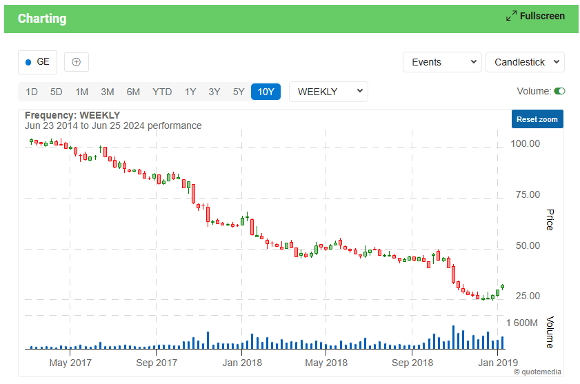
In a Doji pattern, the market explores its options both upward and downward, but cannot commit either way. After a long uptrend, this indecision manifest by the Doji could be viewed as a time to exit one’s position, or at least scale back. Similarly, after a long downtrend, like the one shown above of GE Aerospace, reducing one’s position size or exiting completely could be an intelligent move.
It is important to emphasize that the Doji pattern does not mean reversal, it means indecision. Doji’s are often found during periods of resting after a significant move higher or lower; the market, after resting, then continues on its way. Nevertheless, a Doji pattern is a great sign that a prior trend is losing its strength, and taking some profits might be well advised.
SUMMARY
There are many other simple candlestick patters. These include the Dragon Fly Doji, the Gravestone Doji, hammers, hanging men, and many others. We hope you take the time to learn about all these patterns as they will have a huge impact on your ability to be a strong trader.
Volume is one of the two key indicators for a Technical Analyst. These analysts believe that stock volume precedes price and confirms stock price patterns. Analysts also believe that the reason volume spike is that large institutional buyers are making a move on the stock. Today we will analyze if volume on its own is enough to drive a stock higher or if volume combined with other factors are necessary for future price increase. Lets follow these two groups over the next month.
The following five $10+ NASDAQ stocks have the highest volume without looking at any other indicator.
All these stocks bought on 2/28/2013 – Portfolio UP 5.8% after 15 days (3/22/2013)
Anika Therapeutics (ANIK) – volume up 1560%
Boulder Brands (BDBD) – volume up 731%
Aixtron SE (AIXG) – volume up 491%
Babcock & Wilcox Company (BWC) – volume up 261%
Steiner Leisure Limited (STNR) – volume up 261%
The following five $10+ stocks have the highest volume for stocks with very strong patterns like New Highs, Cup with Handles, etc. – Portfolio UP 11.2% after 15 days (3/22/2013) with one stock up 36.44%
Chicago Bridge & Iron (CBI) – volume up 267%
Saia Inc (SAIA) – volume up 250%
Ocwen Financial Corp (OCN) – volume up 130%
Homeaway Inc. (AWAY) – volume up 75%
Shutterstock Inc. (SSTK) – volume up 71%
SUMMARY AS OF 3/4/2013 While we expect stocks that have huge increases in volume with a large green candlestick to produce continued growth, this is exceptional. We should note that the stocks with the larger volume increase without a perfect stock chart have improved 19% faster. Portfolio 1 is now at 4.6% and portfolio 2 has advanced 3.6%.
SUMMARY AS OF 3/8/2013 Both portfolios continue to advance. Portfolio 1 is now at 5.3% and portfolio 2 has advanced 4.2%. Pretty good for a week’s time.
SUMMARY AS OF 3/15/2013 As you would expect, the HUGE volume on 2/28/2013 together with a market that is mostly positive has provided continued growth for our portfolios. The one with the strongest volume but without a good chart have advanced 6.65% and the ones with a good chart and strong volume have advanced 9.07%.
SUMMARY AS OF 11/18/2013
Here is a summary after 8 months.
Anika Therapeutics (ANIK) – up 140%
Boulder Brands (BDBD) – up 60%
Aixtron SE (AIXG) – down 6.5%
Babcock & Wilcox Company (BWC) – up 17.5%
Steiner Leisure Limited (STNR) – up 16.3%
The minimum amount of equity that must be maintained in a margin account. NYSE and FINRA a 25% margin of the total market value of the securities in the margin account. This is a minimum for all margin accounts and many brokerages have higher maintenance margin requirements of 30-40%.
Maintenance Margin example
If you had a margin account in which your initial margin was 1000$ and because of a loss on your asset, your maintenance margin then rose to 1200$. You would get a margin call and would have to post the additional margin or your broker will automatically close your position out. This does not mean that you have not had a loss, however, you will still have lost money on your account since you had a loss on your asset. Posting aditional margin only allows you keep your position “open” or essentially to keep “playing”.
Note: HowTheMarketWorks does not require maintenance margin so you should be extra careful with your short positions!
The percentage of the purchase price of stocks (that are purchased on margin) that an investor must pay for with his own cash or marginable securities.
When a broker requires an investor that is using margin to add additional deposit funds so that the margin account returns to the minimum maintenance margin amount. A margin call happens when your account value drops to a value below that allowed by a broker. For example, if a stock, purchased on margin, drops in value, the amount of your money in an account may drop below the specified percent of the investment that you agreed to when you chose to buy the stock with margin.
Margin Call Example:
Let’s say you have posted your initial margin on a short trade of a 1000$ and then the price of the stock goes up. Since you shorted, you will be at a loss. Your broker will then call you (or perhaps e-mail you) and let you know that you need to add additional margin to get back to the specified maintenance margin. If you do not within a certain period of time, laid out by your broker, he will automatically close your position.
A corporation is an entity that abides by specific legal requirements that sets it apart as having a legal existence, as an entity separate and distinct from its stockholders (owners). They are owned by their stockholders who have the right to share in profits and losses produced by the firm’s operation.
Characteristics of a Corporation
(1) Legal existence: It can (as can a person) buy, sell, own, enter into a contract, and sue people or other corporations and be sued by them. It can be charitable or even commit criminal offenses.
(2) Limited liability: its stockholders have limited liability with the corporation’s creditors unless the owners give personal-guaranties.
(3) Continuity of existence: It will continue to exist beyond the life spans of its stockholders and founders because ownership in a corporation (stocks) can be sold, donated or bequeathed.
 A time-tested guide to stock trading market cycles. Published every year since 1968, the Stock Trader’s Almanac is a practical investment tool with a wealth of information organized in calendar format. Everyone from well-known money managers to savvy traders and investors relies upon this annual resource for its in-depth analyses and insights. The Stock Trader’s Almanac 2013 contains essential historical price information on the stock market, provides monthly and daily reminders, and highlights seasonal trading opportunities and dangers. Learn More!
 An indispensable resource for today’s active commodity, currency, futures, and ETF trader. In the 2013 Edition of the Commodity Trader’s Almanac, Jeffrey Hirsch has once again put together an essential tool for both professional traders and those who are just getting started and need to understand the complex and exciting world of alternatives. Created in a similar fashion to the Stock Trader’s Almanac—trusted for over 40 years—the Commodity Trader’s Almanac is a comprehensive guide featuring monthly strategies, patterns, trends, and trading techniques geared towards the major commodities and currencies, as well as ETFs, futures, and options. Learn More!