Depreciation (also known as amortization) refers to the gradual and permanent decrease in value of the assets (referred to as a depreciable asset) of a firm, nation or individual over its lifetime.

An asset can depreciate for many reasons such as due to wear and tear or it has become obsolete.

Depreciation is a necessary concept because as a company buys a fixed asset (such as new equipment), management expects the asset to be useful and generate the necessary revenues over time.

Another reason for depreciation is that without it, fixed assets in the balance sheet will be overstated.  For example the market value of a 5-year-old piece of equipment is not worth the same as when it was purchased brand new.


How to calculate Depreciation

In order to calculate depreciation, four values are needed:

(i)                Initial cost of the asset;

(ii)               Expected salvage value of the asset (which refers to the value of the asset when it can no longer be used in production.  For example, an asset can be sold for spare parts or metallic contents after it is retired from its original function.)

(iii)             Estimated useful life of the asset;

(iv)             A specific method of apportioning the cost of over the life (which will de discussed below).


Different types of Depreciation Methods

(a) Straight Line Depreciation

Straight line depreciation is the most often used technique and also the simplest.

The owner of the asset estimates the salvage value of the asset at the end of its useful life and expenses a portion of the original cost in equal proportions over that period and is calculated as follows:

For example, a Pizzeria purchases a new oven that is expected to perform at an optimal level for 8 years, for a cost of $8,000.  After the 8 years, the oven can be sold for spare parts for $750.

Annual Depreciation Expense =         ($8,000 – $750) / 8 years = $906.25

The depreciation figure implies that the book value of the oven as represented in the fixed assets portion of the balance sheet loses $906.25 in value each year.

After 1 year, the owner of the Pizzeria would list the oven has having a value of $8,000-$906.25 = $7093.75.

The second year it would be $ 8000 – (2 x $906.25) = $6,187.50, and so on.

(b) Declining-Balance Method

A Declining-Balance Method is an accelerated depreciation method and implies that the asset loses the majority of its value in the first few years of its useful life, since most assets perform optimally in the first few years.

The salvage value is not used in the calculation, as the Declining Balance Method assumes that the depreciation value at the end of the life is higher than the salvage value.

The annual depreciation rate is calculated as:

Annual Depreciation = Previous year’s value

For example, the same Pizzeria has expanded its business and now offers a delivery service.

Depreciation Example

The owner brought a brand new car for $20,000, and expects to use the car for 5 years before being replaced.  The asset depreciates by a factor of 1/N as follows:

YearDepreciationYear –end Value
1[$20,000/5]=$4,000$20,000-$4,000=$16,000
2[$16,000/5]=$3,200$16,000-$3,200=$12,800
3[$12,800/5]=$2,560$12,800-$2,560=$10,240
4[$10,240/5]=$2,048$10,240-$2,048=$8,192
5[$8,192/5]=$1638.4$8,192-$1638.4=$6553.6


(c) Activity Depreciation

Activity Depreciation is based on level of activity rather than time.

When the asset is originally purchased, its lifetime use is estimated in terms of the level of activity.

Returning to the Pizzeria example, the owner assumes that their delivery car will be used for 60,000 miles, and can be sold for spare parts for $1,000.

The per-mile depreciation rate is calculated as:

Depreciation per mile = (Cost – Salvage) / Total miles

Depreciation per mile = ($20,000 – $1,000) / 60,000 miles = $0.316 per mile

If after 1 year, the car has been used for 13,000 miles the car would have depreciated by:

$0.316*13,000 = $4,108

Thus, having a book value of:

($20,000 – $1,000 – $4,108) = $14,892. 


Conclusion

The proper use of conservative and accurate depreciation rates are of concern to a company’s management.

Different accounting rules allow assets to be written off over different periods of time, and at different rates.

A public company should explain clearly which depreciation method is used in the company’s annual 10K filling (annual report of a company’s performance), as different depreciation methods result in large differences.

Consumer Price IndexThe consumer price index (CPI) is simply an indicator of changes in prices of goods and services experienced by consumers in a given country over time. The CPI in the United States is defined by the Bureau of Labor Statistics as “a measure of the average change over time in the prices paid by urban consumers for a market basket of consumer goods and services.”

The CPI is a statistical estimate using the prices of sample items whose prices are collected on a regular basis. Sub-indexes and sub-sub-indexes are computed for different categories and sub-categories of goods and services.  The annual percentage change in CPI is used to measure inflation. The CPI can be used to index the value of wages, salaries, pensions, and for regulating prices to show changes in real values. In most countries, the CPI is, along with the population census and the USA National Income and Product Accounts, one of the most closely watched national economic statistics.

The CPI is calculated at fixed intervals, usually monthly or quarterly, and is obtained by comparing the current cost of a “basket” of products to the prices seen in the past.

The products that make up a specific basket remain constant and do not change from year to year. The items that can be found in the basket are diverse, and include products as varied as garlic bread, frozen burgers, bananas, jeans, paint, dining room furniture, dishwasher tablets, DVD players etc.

The CPI is calculated as a percentage change from the base year (established in different years in different countries) when the first finding was established, and by default given a value of 100 (example will appear below.)

The CPI is sub-indexed into many categories such as Housing, Food and Beverage, Medical Care, Apparel and Entertainment for example.

What Data is needed?

Two types of data are needed in order to calculate the CPI.

  1. The first aspect is related to the price of all items in the basket,
  2. The second being weighting data, that is, what percentage of each item will be represented in the findings (for example, milk and bread is purchased more often than jeans, and as such should have a higher representation in the data.)

The price component is tabulated by taking a sample of goods and services from several different geographical regions, over several timeframes.

This is usually obtained by calling business owner to survey their prices.

Sounds complicated?  Think of it this way: it is impossible to tabulate the price of every apple sold at every grocery store in a country every day.

To simplify, the CPI simply takes a sample, which is believed to be statistically significant and representative of the entire country.

How do we determine the second aspect of the data?

The ‘weights’ of the items are typically based on results from surveys that are distributed to households.  The key is that the sample of consumers is random (where every single resident of the country has an equal chance of being included in the survey).

Thus, in our sample, we should have a mix of people from all different walks of life, and their answers put together should give us the ‘average’ consumer.

From here, we can have an excellent basis for the ‘weights’ of the products in the basket.


How is it calculated?

As previously mentioned, we need to remember that the base year was valued at 100.  We use this as a stepping-stone in our calculations.  Suppose that in the first year, economists tabulate spending habits:

15% of income is spent on food; the average value is $5,000

45% of income is spent on housing; the average value is  $15,000

10% of income on entertainment/leisure; the average value is $3,000

30% of income on everything else; the average value is $6,000

Base CPI = 0.15*$5,000 + 0.45*$15,000 + 0.10*$3,000 + 0.30*$6,000 = 9,600.

Note that 9,600 is just a number and is not a dollar value.  It is simply an index that will be used as a base to determine the change in the CPI over subsequent periods.  Since we are in

the first year our value of 9,600 is set to 100, because of the ease of understanding a base of 100 compared to a base of 9,600.

Let us assume that 20 years as passed, and the new data collected are as follows:

15% of income spent on food; the average value is $7,000

45% of income spent on housing; $21,000

10% of income on entertainment/leisure; $4,000

30% of income on everything else; the average value is  $8,000

Current CPI = 0.15*$7,000 + 0.45*$21,000 + 0.10*$4,000 + 0.30*$8,000 = 13,300


From this data, we are able to calculate our CPI increase by using the formula:

Current CPI                        13,300

CPI Increase =     __________________  =    ———–  = 1.3854

Base Year CPI                      9,600


New CPI Number = 100%*1.3854 = 138.54


Conclusion

The CPI is the most widely used indicator of price changes in many countries, and as such, it directly or indirectly affects every citizen of a country.

How is this the case? Consider a government that grants old age security pension and other welfare payments.  Proper tracking of the CPI allows the government to know how much to increase payments respectively due to an increase in the CPI.

Economists, marketing, executives and investors can all benefit from following the CPI closely to monitor trends in consumer spending and can use this data to their benefit.

For example, an investor might notice that the sub index of food is increasing at a consistent base, so it may be an indication to invest in a grocery chain by buying its stock.

As with every economic indicators, there are limitations.  The CPI does not take into account changes in taxes, educational quality, health care, air and water quality, crime levels and many other factors.  The CPI is still a widely used price index to measure spending trends and its effect on the economy.

Key Words: Consumer Price Index, Price, Spending, Income, Government, Economists

Stocks with a very small market capitalization. Small caps definition varies but generally it is a company with a market capitalization between $300 million and $2 billion.

The biggest advantage of investing in small-cap stocks is the opportunity to beat institutional investors. Most mutual funds have restrictions restricting them from buying stock in a small cap stock. Some mutual funds would not be able to give the small cap a meaningful position in the fund. To overcome these limitations, the fund would usually have to file with the SEC, which means tipping its hand and inflating the previously attractive price.

CommodityA basic material used in manufacturing or commerce that is interchangeable with other the same commodities coming from a different source.  The quality of a specific commodity may differ slightly, but it is essentially uniform across producers. When they are traded on an exchange, commodities must also meet specified minimum standards, also known as a basis grade.  Typical types of commodities are corn, gold, oranges, wheat, silver, steel, etc.

Candlestick Shadow
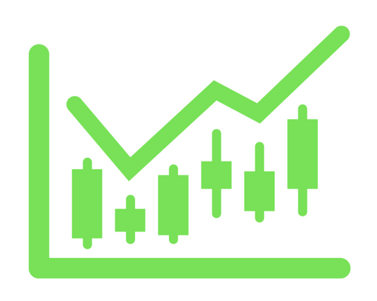
For a candlestick chart, the body or real body is the wide or colored part of a candle that represents the range between the opening and the closing prices over a specific time period (minute, hour, day, week or other).  They are the most basic building block for candlestick charts.

Candlestick ShadowA point on a candle stick chart representing a specific time period (a day, an hour, a minute, etc) in which the underlying stock price has moved. Candlesticks will have a body and usually two wicks – one on each end. For a white (could also be green) candlestick, the bottom of the body represents the opening price and the top of the body represents the closing price.  For red candlesticks, it is just the other way around. The top and bottom tips of each wick are the day’s highest and lowest price respectively.

Candlestick ShadowA small line (like a candle wick) found at the top or bottom of an individual candle in a candlestick chart. The shadow illustrates where the price of a stock has fluctuated relative to the opening and closing prices. A shadow can be located either above the opening price (upper shadow) or below the closing price (lower shadow). These shadows illustrate the highest and lowest prices at which a security has traded suring a specific period of time. When there is a long shadow on the bottom of the candle (like that of a hammer) there is a suggestion of an increased level of buying and, depending on the pattern, potentially a bottom.

The most basic skill needed for investing is the ability to read a stock chart and then understand how that data can aid your investing success.  One of the biggest mistakes of today’s investors is overlooking this basic skill and shooting from the hip.  This article explains the importance of candlesticks which are the smallest building block of stock charts.

Candlesticks are typically one of four colors.  Sometimes you will see green candlesticks represented by hollow and black-filled candlesticks. These candlesticks represent the price closing higher than the open price. The black and red-filled candlesticks represent the price decreasing on that day.

LONG VERSES SHORT BODIES

The longer the body of a candlestick, the more the pressures for the stock to increase or decrease in price verses the opening price. A short bodied candlestick represents a consolidation of price where buyers and sellers were more in agreement on what the price of the stock should be.

LONG HOLLOW or GREEN CANDLESTICKS show STRONG BUYING PRESSURE.  The longer the body the farther the close was from the open and the more the price increased from the opening price. Often this represents strong BULLISH pressures but this is also dependent on VOLUME and the pattern that the prior candlesticks have created. If this long green or clear bodied candlestick occurs at the bottom of an extended period of price decline, it might show that the bulls have dug in and set a price that they feel is too low. If they defend this price and continue to buy at this price forcing the stock up in value, it is called a RESISTANCE PRICE.

LONG BLACK or RED CANDLESTICKS show STRONG SELLING PRESSURE.  If the long bodied candle was RED or solid black, it might show panic where those who had held on to the stock admitted that the stock would fall or it might show that an institution was ready to dump a large block of their holdings to take profits.

LONG VERSES SHORT SHADOWS. The upper and lower wick or shadows can show very valuable information about a trading session. Upper Shadows represent the day’s high price and the Lower Shadow represents the day’s lowest price. Days with short shadows indicate that most of the trading happened near the open and close prices. Candlesticks with long shadows show that buyers and/or sellers fought loosing battles to bring the price higher or lower. When the top shadow is long, it shows that the buyers (also called the bulls) fought to take the price higher and lost as the sellers (or bears) pulled the price down again. The bottom shadow represents the sellers driving the price down and the buyers helping to pull it back up again.

Economy Drives Stake in Gold which Fell 12% over Week

Over the past decade, gold seemed like the ultimate investment.  No matter what happened in world events, in the market or with the economy, it consistantly returned double digit returns for investors.  That ended last weeek. Gold is down 12% in the last week.  Silver is down 11% today.  This is a loud and clear wake up call to Wall Street that all is not well in our economy.

On Friday, gold opened below the $1,550 resistance line which tripped a massive number of stop losses.  That was just the beginning of the carnage. For the rest of the day the bulls and bears fought. The bulls twice put the bears on hold but Gold continued to trip other critical resistance lines including the ever important $1,500 line before coming to rest at $1,488 an ounce – a 5% loss. Today, we see a continuation of Friday’s action with even the $1,400 resistance line falling to the bears.

As you can tell from this analysis, momentum investors are dominating the gold market.  Gold is becoming a different asset with a very different kind of owner.  It still has very strong fundamentals.  It’s value for manufacturing continues to increase. Yet since November, as we can see from the chart, key points of support and resistance have trigger gold’s price fluctuations rather than industrial supply and demand. This clearly shows the impact of momentum investors.

The events in Europe, like the recent bank account forfeitures in Cyprus, and the out of control spending and debt in the US are prime suspects. In turn, Analysts have downgraded gold. The failing economy is pointing the direction and momentum investors are driving the price of gold.

Is the shake out done?  Will we see more gold selling?  $1,500 was a very important line of resistance for gold. Since it gave way followed by $1,400 in such quick order, this gold reversal will prabably continue with other commodities following suit in random fashion.  Oil is the most visible victim as we have seen at the pumps.  Silver dropping 11% today was even more breath taking. The clearest advise is not to catch this falling knife. Don’t try to guess the bottom as it is the easiest way to loose money.

Why have commodities been falling while the US government has been printing money like it is going out of style? Most of us would expect inflation with a rising gold price. Instead, the bleak future of the economy has more impact on gold investors. If we do not see gold emerge back above $1,500, the market will be telling us to expect the economy will not be far behind.

The qualitative and quantitative information that contributes to the economic well-being and the subsequent financial valuation of a company, security or currency. Analysts and investors analyze these fundamentals to develop an estimate as to whether the underlying asset is considered a worthwhile investment.  For businesses, information such as revenue, earnings, assets, liabilities and growth are considered some of the fundamentals.

An investment strategy that aims to capitalize on the continuance of existing trends in the market. The momentum investor believes that large increases in the price of a security will be followed by additional gains and vice versa for declining values.

Resistance lineA point or range in a chart that caps an increase in the price of a stock or index over a period of time. An area of resistance, resistance line or resistance level indicates that the stock or index is finding it difficult to break through it, and may head lower shortly. The more times that the stock or index tries unsuccessfully to break through the resistance line, the stronger that area of price resistance becomes.

How To Use Price-To-Sales Ratios To Value Stocks
The price-to-sales ratio (Price/Sales or P/S) provides a simple approach: take the company’s market capitalization (the number of shares multiplied by the share price) and divide it by the company’s total sales over the past 12 months. The lower the ratio, the more attractive the investment. As easy as it sounds, price-to-sales provides a useful measure for sizing up stocks. But investors need to be mindful of the ratio’s potential pitfalls and possible unreliability.

How P/S Is Useful
In a nutshell, this ratio shows how much Wall Street values every dollar of the company’s sales. Coupled with high relative strength in the previous 12 months, a low price-to-sales ratio is one of the most potent combinations of investment criteria. A low P/S can also be effective in valuing growth stocks that have suffered a temporary setback.

In a highly cyclical industry such as semiconductors, there are years when only a few companies produce any earnings. This does not mean semiconductor stocks are worthless. In this case, investors can use price-to-sales instead of the price-earnings ratio (P/E Ratio or PE) to determine how much they are paying for a dollar of the company’s sales rather than a dollar of its earnings. P/S is used for spotting recovery situations or for double checking that a company’s growth has not become overvalued. It comes in handy when a company begins to suffer losses and, as a result, has no earnings (and no PE) with which investors can assess the shares.

Let’s consider how we evaluate a firm that has not made any money in the past year. Unless the firm is going out of business, the P/S will show whether the firm’s shares are valued at a discount against others in its sector. Say the company has a P/S of 0.7 while its peers have higher ratios of, say, 2. If the company can turn things around, its shares will enjoy substantial upside as the P/S becomes more closely matched with those of its peers. Meanwhile, a company that goes into a loss (negative earnings) may lose also its dividend yield. In this case, P/S represents one of the last remaining measures for valuing the business. All things being equal, a low P/S is good news for investors, while a very high P/S can be a warning sign.

Where P/S Fall Short
That being said, turnover is valuable only if, at some point, it can be translated into earnings. Consider construction companies. They report very high sales turnover, but, with the exception of building booms, they rarely make much in the way of profit. By contrast, a software company can easily generate $4 in net profit for every $10 in sales revenue. What this discrepancy means is that sales dollars cannot always be treated the same way for every company.

Many people look at sales revenue as a more reliable indicator of a company’s growth. Granted, earnings are a complicated bottom-line number, whose reliability is not always assured. But, thanks to somewhat hazy accounting rules, the quality of sales revenue figures can be unreliable too.

Learn how to use penny stocks & beat the stock market!
Comparing companies’ sales on an apples-to-apples basis hardly ever works. Examination of sales must be coupled with a careful look at profit margins and their trends, as well as with sector-specific margin idiosyncrasies.

Debt Is a Critical Factor
A firm with no debt and a low P/S metric is a more attractive investment than a firm with high debt and the same P/S. At some point, the debt will need to be paid off, so there is always the possibility that the company will issue additional equity. These new shares expand market capitalization and drive up the P/S.

Companies heavy with corporate debt and on the verge of bankruptcy, however, can emerge with low P/S. This is because their sales have not suffered a drop while their share price and capitalization collapses.

So how can investors tell the difference? There is an approach that helps to distinguish between “cheap” sales and less healthy, debt-burdened ones: use enterprise value/sales rather than market capitalization/sales. By adding the company’s long-term debt to the company’s market capitalization and subtracting any cash, one arrives at the company’s enterprise value (EV).

Think of EV as the total cost of buying the company, including its debt and leftover cash, which would offset the cost. EV shows how much more investors pay for the debt. This approach also helps eliminate the problem of comparing two very different types of companies:

The kind that relies on debt to enhance sales and

The kind that has lower sales but does not shoulder debt.

The Bottom Line
As with all valuation techniques, sales-based metrics are just the beginning. The worst thing that an investor can do is buy stocks without looking at underlying fundamentals. Low P/S can indicate unrecognized value potential – so long as other criteria like high profit margins, low debt levels and growth prospects are in place. In other cases, P/S can be a classic value trap.

New York stock exchange facade with USA flags

Peter Lynch’s “invest in what you know” strategy has made him a household name with investors both big and small.

An important key to investing, Lynch says, is to remember that stocks are not lottery tickets. There’s a company behind every stock and a reason companies — and their stocks — perform the way they do. In this book, newly revised and updated for the paperback edition, Peter Lynch shows you how you can become an expert in a company and how you can build a profitable investment portfolio, based on your own experience and insights and on straightforward do-it-yourself research. There’s no reason the individual investor can’t match wits with the experts, and this book will show you how.

Spotting-price-swingsThe proof is in the patterns – and so are the trading profits! Being able to precisely time your market moves by reading cycles and patterns is the key to sustained trading success. Now, the world’s foremost authority on pattern recognition and cycles and author of over 25 trading books, Jake Bernstein, guides you step-by-step through the process, as he reveals several of his preferred, most effectives pattern strategies. Leading off with his personal favorite – a high-yielding pattern for trading S&P Futures on Monday based on price action from Friday – Bernstein also features … · A key method for using moving averages with his price patterns · Tips for identifying new trends in every time frame – ideal for short-term traders and long-term investors alike · Patterns based on trader psychology · Precise entry & exit methods Thorough, fast-paced, even funny – this persuasive presentation, with full online support manual, is a “must have” for today’s active trader. See why even professional traders are raving that … “Bernstein’s approach is so simple – yet so powerful – I wish I had this video years ago.”

Timing the market Profit in both Bull and Bear MarketHow to profit in Bull and Bear markets with technical analysis. This groundbreaking work discusses all the major technical indicators and shows how to put the indicators together in order to provide excellent buy and sell signals in any market. One of the best-written, most accessible books on technical analysis ever published.

Lifted by Anna Fields’s intelligent reading of the complicated material, this investment lesson describes almost every possible predictor of movement in the major categories of investment. Though sounding at first like too much information, it comes together; this is actually a graduate-level course for the analytic investor who wants to leave nothing to chance. The three CDs have the section titles listed for easy referencing. Once the indicators make sense, the suggested homework may require more time and diligence than most people can muster. But for listeners so inclined, there are few, if any, investment audios that are more sophisticated, compact, and accessible

High inflation and high unemployment occurring simultaneously.

Today, you can find many articles warning of an imminent market pull back. As a new investor, it is helpful to understand how the various indicators contribute to these forecasts so that you will be forewarned and can make appropriate alterations to your portfolio before a bottom drops out. Those who are unprepared often pay a large penalty.

Current Events

Lets first look at current events. There is a very strong correlation between these events and the near term direction of the market. This week, there were reports that the job market and service sectors are in worse shape than predicted. The Eurozone economy, which has dominated the financial press, is continuing to unravel.  Debt, driven by the US government, as a percent of GDP is more than 10 times higher today than it was prior to the great collapse of the 20’s.  Market fear from these events can quickly stall the economy.   While our economy is so shaky, our government ignores the historical lessons of our prior recessions.  Obama has just release new guidelines for federal programs that will 1) remove capital from the market, 2) encourage people with weak credit ratings back into home ownership and 3) increase business uncertainty, risk and fear. The economic stall can be associated with any random event with all these other issues bearing down.

Beside specific current events, we know that seasonality has an impact on specific stock sectors as well as the market in general.  Our “Best Months to Buy” article reported that May, June, August, September and October are historically the worst months of the year to hold stock.

Technical Indicators

For many, technical indicators are hard to understand so are overlook. In fact, using these tools are quite easy as they are readily available on the web.  We just need to understand what they mean.  Lets look at what some of these indicators are saying about our current economy and the market.

As most of us know, the most popular market indexes are hitting record highs but with lower volume.  As you may remember from our previous article, volume is the most important early warning indicator for predicting changes in demand and the direction of price.

Avid technical analysts use the MACD as one of the most accurate indicators.  Today when you look at the MACD for the DOW, you will see that it is converging and heading toward a bearish crossover.  This is a very strong technical indicator predicting a downturn in the market.  If the two lines used for MACD continue in their path and cross over, you will find that the smart investors will quickly leave uneducated investors holding the bag.

Finally, there have been five distribution days over the last month. A distribution day is when the market has a big loss with large volume. When you have five distribution days, then these analysts specify that the market moves from a confirmed up trend to a confirmed down trend. Some stock picking companies use this one indicator as the sole tool in choosing market turns.  To see a complete list of technical indicators, please click here.

In next week’s newsletter, I will write about how to adjust your portfolio when you have identified an upcoming down turn.

Long-awaited government rules aimed at “tightening” home lending standards to head off another mortgage crisis are not as tough as the Obama administration is advertising.

The rules issued Thursday by the Consumer Financial Protection Bureau, the credit watchdog agency created by the Dodd-Frank “financial reform” law, require income verification and limits on household debt loads.

They also ban mortgages with risky features, such as interest-only payments, where the borrower doesn’t make payments on the loan principal, or negative amortization, where the principal rises over time.

But the devil is in the details of the 804-page regulation, titled the “Ability to Repay and Qualified Mortgage Standards.” What’s not required is any minimum down payment or credit score, which studies show are the two most important factors for predicting the ability of a borrower to pay back a home loan.

The regulation “does not require creditors to obtain or consider a consolidated credit score or prescribe a minimum credit score that creditors must apply,” page 741 states.

Contrary to some published reports, moreover, no job is required to qualify for a home loan, just “documented” income, which could include welfare payments, as well as alimony or child support payments.

“Income received from government assistance programs are acceptable,” the Obama administration decrees in its ruling.

It maintains that credit scores “may not be indicative of the consumer’s ability to repay.”

Also, lenders may “look to nontraditional credit references, such as rental payment history or utility payments.”

This underwriting practice has been widely blamed for waves of mortgage defaults in states with high Hispanic immigrant populations, such as California and Nevada.

The rule, further, does not require verification of debt obligations. And the 43% debt-to-income ratio requirement applies to a small slice of borrowers taking out jumbo home loans of more than $400,000 nationally, or $700,000 in high-cost markets like New York.

Some regulators sought a 20% down payment rule. But the final rule makes no down payment requirement and allows down payment assistance from community organizing groups.

This was a major victory for the affordable-housing lobby, which fought minimum down payments. The National Community Reinvestment Coalition, Washington’s chief lobbyist for the anti-redlining regulation that fed the subprime frenzy, the Community Reinvestment Act, argued that such a standard would restrict credit access in minority and other “underserved” communities.

Also missing from the new mortgage rules are any minimum down payment or credit score requirements for federally controlled Fannie Mae or Freddie Mac or the Federal Housing Administration, which together underwrite nine out of every 10 new mortgages in the country.

In fact, Fannie and Freddie are grandfathered from any of the rule changes for up to seven years. So is the FHA, which is now staring at insolvency, after taking up the affordable-lending slack from failed Fannie and Freddie.

“This rule does little to limit borrower leverage and lays the foundation for the next bust,” said Edward Pinto, former chief Fannie Mae credit officer and now an American Enterprise Institute fellow.

Cyprus’s president says that country’s economic crisis is now contained, and it won’t need to leave the euro. But even if you believe him, that hardly means Europe is out of the woods. Slovenia was prompting concern last week, and Luxembourg and Malta are also stoking worries. And that’s not to mention the biggies Italy and Spain, whose failure would probably spark a worldwide economic crisis.

So which of these countries is likeliest to doom us all? Let’s run through the possibilities.

Cyprus
So let’s say we don’t believe the Cypriot president. How could things still go wrong for the small island nation? Well, if the capital controls don’t work as planned and depositors start withdrawing money from Cyprus’s banks in reaction to the haircut, that could threaten the stability of those already fragile institutions. It would mean that they may not have enough in the way of deposits to cover a precipitous drop in loan repayment, as would occur if, say, more of Greece’s debt were to go bad. Basically, if either of the country’s two big banks fail despite the bailout, everything starts to fall apart again.

Luxembourg
This tiny duchy, sandwiched between France, Belgium and Germany, is a historical center of the European project, having been a founding member of the European Coal and Steel Community, which evolved first into the European Economic Community and then into the European Union. Jean-Claude Juncker, who since 1995 has served as prime minister of the nation of half a million people (about the same population as the District of Columbia, or Vermont), has twice served as president of the European Council and until recently chaired the Euro Group, which has jurisdiction over policy involving the currency and which engineered the Cyprus bailout. His predecessor left the office to become president of the European Commission.

But it’s also a major banking center. According to Businessweek’s Peter Coy, its bank assets currently total about 23 times the country’s GDP. That’s down from about 29 times its GDP before the crisis. Those assets are generally safer bets than Cypriot debt, as the country is much less exposed to bad debt from Greece. But if a sizable chunk of it goes bad, there’s just no plausible scenario in which the country could pay to recapitalize the banks itself. As of late 2011, 29 percent of its assets came from Belgium, Germany and France, so those countries may be less likely to accept haircuts than they were with Cyprus, whose banking clients included many Russians. Any bailout would probably have to come from those countries’ treasuries.

The country is important enough to the continent’s finances that those countries would be inclined to agree to such a bailout, but if they don’t, or if the bailout fails to prevent significant institutions in Luxembourg from collapsing, then clients in Germany, France and elsewhere could lose a lot of money, battering the European economy.

Malta
Malta, best known until now for the Knights thereof and for Goosio, friend of Maltese children everywhere, is, like Cyprus, a tiny island nation with an outsize banking sector. As of December, its bank assets totaled 792 percent of GDP, an higher share even than seen in Cyprus. The country, as of mid-2012, was even more exposed to Greece, as well, with exposure totaling 4.3 percent of GDP.

But overall, international observers are less worried about Malta than they are about Cyprus. In May 2012, the International Monetary Fund (IMF) judged: “The sensitivity of the Maltese banking sector to sovereign risk events in Europe is low given very low direct exposures to vulnerable countries, as well as domestic banks’ reliance on a traditional retail deposit-based banking model.”

Slovenia
You know we love you, Slovenia. But the bond markets don’t love you, and the country needs to generate several billion euros in bond revenue by the end of the spring. If it can’t do that at a reasonable price, it could have to turn to the troika — the European Central Bank (ECB), the European Commission (EC) and the IMF — for a bailout. The country’s bank assets are much smaller than those of Luxembourg, Cyprus or Malta, but that may not stop bailout-weary European policymakers from demanding major sacrifices in the form of haircuts or, more plausibly, tax increases and spending cuts.

Italy
Italy, the third-largest economy in the euro zone after Germany and France, does not have a government. And even if it gets a government following further negotiations, or after another round of elections, that government is likely to include parties other than that of centrist Prime Minister Mario Monti and the Democratic Party run by Pier Luigi Bersani, both of which have been amenable to Europe’s policy demands.

Beppe Grillo, a comedian whose party finished in third in the latest elections, might play a role, and he is a strong euroskeptic who has called for a referendum on leaving the euro currency. All this might spiral out of control if bond buyers start demanding untenable interest rates. And given the size of Italy’s economy, it might be impossible for even France and Germany to bail it out. Direct bond purchases by the ECB — basically, monetizing the debt — are a possibility, but ECB President Mario Draghi, himself Italian, may demand reforms and concessions in exchange that a dysfunctional Italian government is unable to execute.

Spain
Spain is in the midst of an economic depression with mass unemployment, but it’s moving forward with last year’s bank bailout, having used European funds to recapitalize its banks. However, its attempt to sell one of those rescued banks floundered, which prompted concern that the financial system could need yet more time to recover. The odds of another bailout remain slim, but given how terrible the country’s economic situation is in general, it’d be foolish to rule out the possibility.

Greece
Oh, Greece. Your brand of doom is almost a comfort in this time of crises in countries we had barely heard of before March. But Greece isn’t out of the running yet. There’s still a chance that Syriza, the far-left party that’s currently leading the opposition, could end up running the show. That could spook bond-buyers, sending interest rates up and necessitating either a bailout (which would be likely to involve concessions on budget policy that Syriza would be loath to accept) or exit from the euro, with all the dangers that entails.

Ireland
Despite having a huge banking sector almost on the scale of Luxembourg, Malta or Cyprus, Ireland doesn’t look likely to cause problems anytime soon. It’s been paying back the 2010 bailout from the E.U. faster than it had too, which has pushed bond rates way down. Its economy is still in the gutter but its financial sector doesn’t appear to need outside money in the near future.

Grand Fenwick
Grand Fenwick, having a strong economy based on wine exports, and possessing a sovereign currency, is doing just fine.